
Graphic designs trends are always changing and it’s important to stay on top of these progressions if you’re looking to improve your designs. That’s why this year, I’ve prepared a list of graphic design trends that you should look out for in 2021.
Whether you’re a dedicated graphic designer or not – we should all understand the fundamentals of design. Having strong visuals in your content marketing strategy are essential and incorporating new design trends to your canvas will help take your visuals to the next level!
Here are 10+ graphic design trends you need to know for 2021
1. Nature Themes
Nature themes in graphic design cycle in and out of popularity, much like most style trends. These days, a number of designers are favoring the soft earth tones and calming aesthetic of the natural world. The ambiance of nature combines well with other popular design trends such as soft color schemes, illustration, and vintage fonts, in particular.
This design features a combination of clean text, earth-tone colors, and an image of a lush landscape. Photography and illustrated graphics may be used interchangeably in nature-themed graphic design, depending on the project.
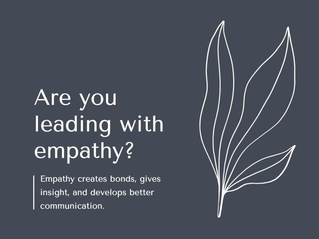
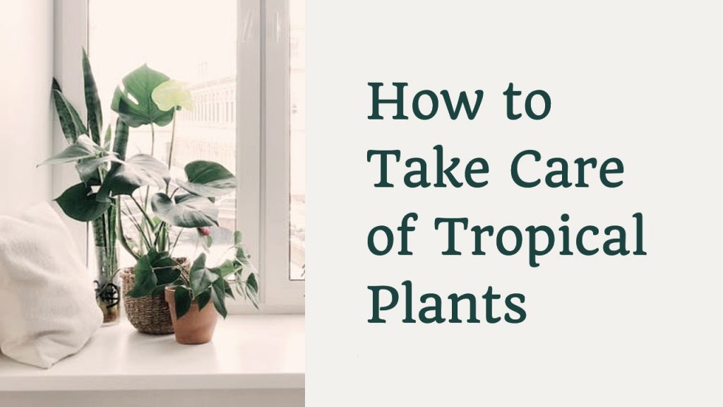
Nature-themed graphic design leverages the beauty of the natural world, both indoors and outdoors. The following design example utilizes a muted color palette that pairs well with the minimalistic image of indoor house plants in natural light.
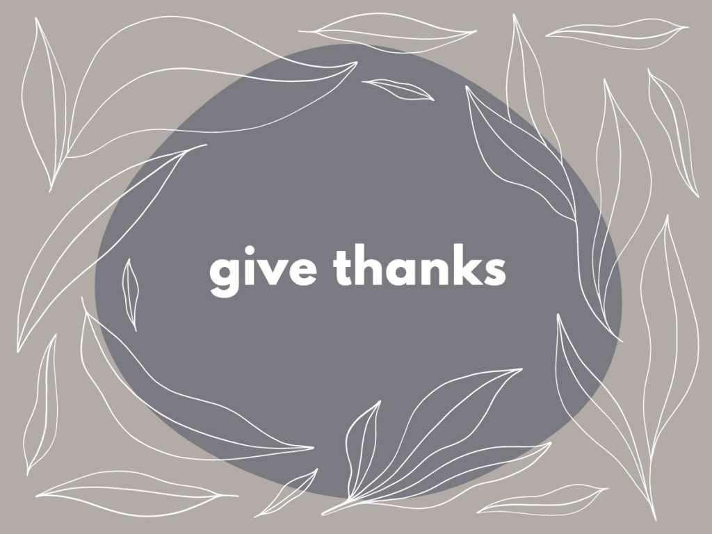
In addition to photography, nature-centric illustration is also a fantastic way to leverage the natural world in your graphic design. The below example uses a muted color palette in addition to delicately-illustrated depictions of leaves in the design. Illustration can be a simplistic but effective way to bring nature into your brand’s visuals, whether the illustrations depict plants, animals, or other elements of the natural landscape.

2. Vintage-Inspired Design
Retro and vintage styles are surging back into popularity. Largely driven by fun fonts, period-specific color schemes, illustrations, and photography, vintage-inspired designs are a classic and fun way to represent your brand.
Businesses can communicate with their customers in an engaging and entertaining way by using eye-catching fonts with a vintage vibe. Simplistic design elements add a little flair without making the design too busy.

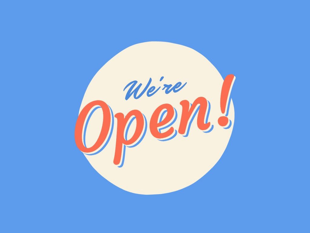
Fonts and color blocks may also be used against an image background. In the following example, the orange-and-white motif works well against the muted colors of the photograph in the background. The Lobster font used in the main headline is an eye-catching, clean script that works well against the orange background.

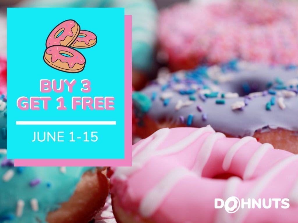
3. Bright, Happy Motifs
Bright and happy designs are always in style. Colorful designs and fun fonts catch your audience’s attention, encouraging them to pause and take a closer look. You can center your bright designs around graphics and fonts, or use a combination of graphic elements, fonts, and photography.
In some designs, such as the example below, the biggest emphasis is on the font and graphic elements. The photograph is a fun feature, but it doesn’t take up much space in the design itself. A yellow drop shadow offsets darker lettering in a unique and interesting way.

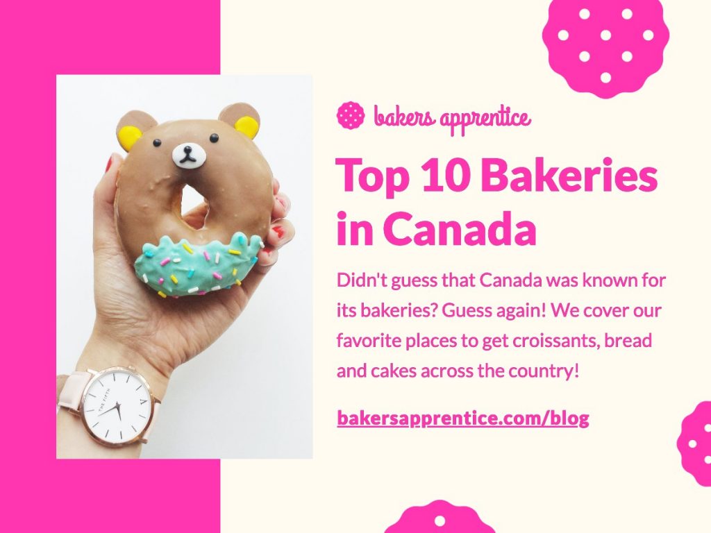
Sometimes, photographs are central to your fun and bright designs. In the next example, the design elements take their cues from the colorful photograph of a donut with sprinkles. The colors and design elements used in the image reflect the bright pink sprinkles on the cupcake, and pair well with the photograph’s color palette.

4. Art House-Style Designs
Designs in the modern, pop art vein of Andy Warhol are emerging as a graphic design trend for 2021. Bright, complementary color palettes work well against geometric backgrounds, stylized objects from the natural world, and pop culture icons. Simple, clean, and sometimes vintage-style fonts offset the other elements of the design.
Pop art design can feature iconic elements of pop culture (think: Warhol’s famous depiction of Marilyn Monroe). But it might also feature pieces of fruit, stylistic inanimate objects from the home (like a vintage rotary phone), or eye-popping patterns in a variety of clashing colors.

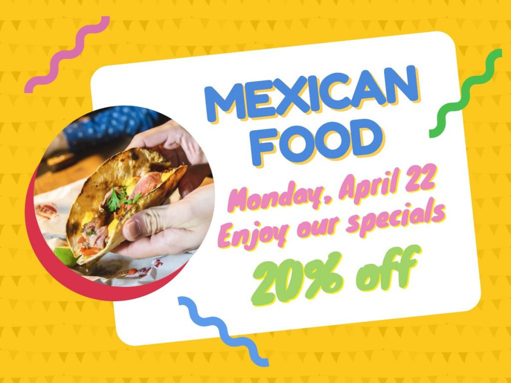
5. Fun, Cartoonish Themes
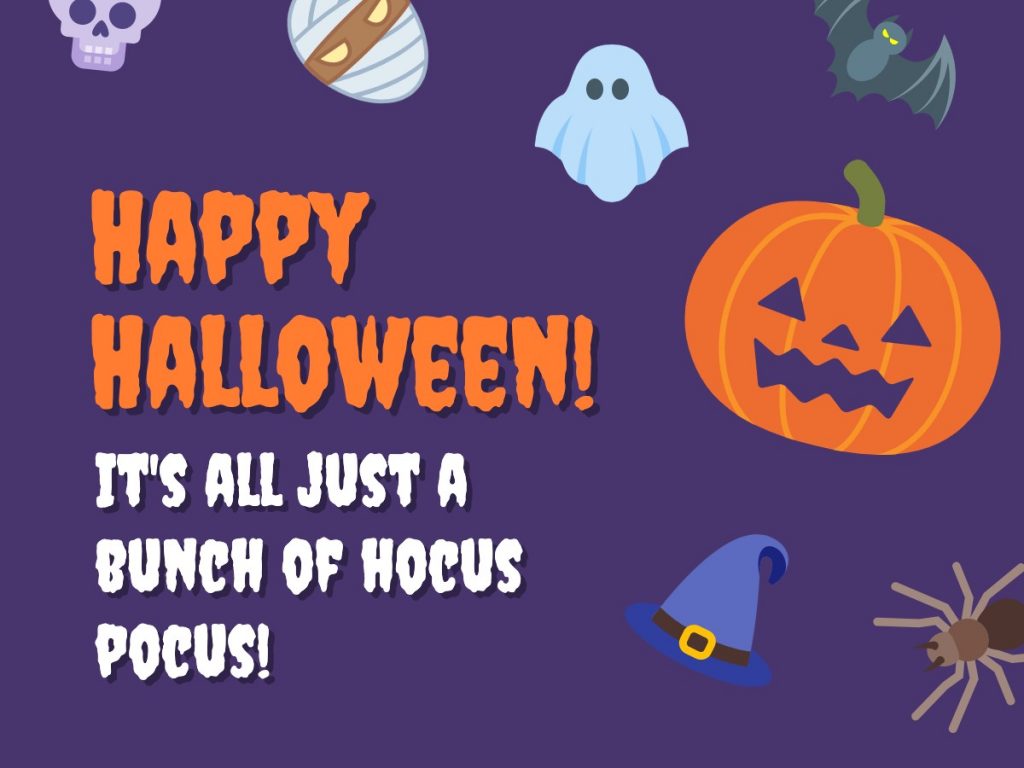
Cartoon themes in design work well for brands that focus on fun. You can create these lighthearted designs using vector art, stylized fonts, and eye-popping colors. Whether you’re a kid or a kid at heart, cartoon styling is an attention-grabber. This Halloween graphic does an excellent job of utilizing all three elements in a visually appealing, balanced image.

Simplistic illustrations also work well in designs with a cartoon or animated feel. A simple design with a minimal color palette and clean font can feel fun while maintaining a simplistic brand visual. This is a great way to incorporate a cartoonish style without necessarily making your brand look childlike.

6. Gold Design Elements
Gold and jewel-tone design elements are a beautiful way to add a bit of luxe flair to your graphic design. Whether through photography or illustration, adding gold, silver, bronze, copper, or even gemstone colors or depictions adds a layer of depth and richness to the visual.

Including precious metals and gemstones in your designs where appropriate will give your brand visual a high-end look and feel. This is particularly important for brands looking to attract a luxury clientele or sell products and services at a higher price point. But, blending a little gold into your minimalistic nature design could also make it pop just the right way.
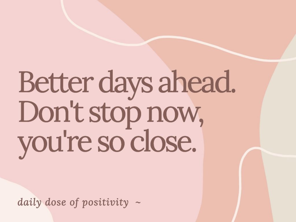
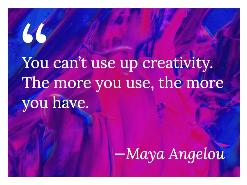
7. Simplistic Color Schemes
Simplistic color schemes are in, and in keeping with minimalist design–which has remained popular for many years, with no end on the horizon. Color schemes such as monochrome, duotone, black and white, and muted color are all great ways to incorporate color into your brand without making it overwhelming for your audience.
In the following example, a clean, white font is overlaid on a monochrome background with varying shades of blue. The background’s clean design lends style to the image while keeping all the viewer’s emphasis on the words. Rather than being distracted by the design, the reader’s eyes are drawn to the lettering.

The muted colors of the following design are reflected and supported by the color of the simple serif font. Plenty of space is left for the lettering to breathe, and the flowing, softly colored background gives the image a slight feeling of motion.

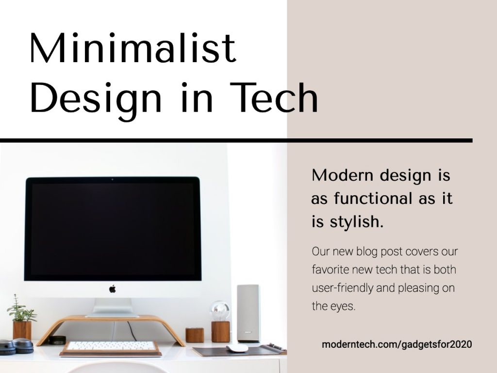
8. Clean, Geometric Designs
Clean, geometric designs are visually interesting and have a sharp, modern look. They’re easy for the eyes to focus on. The lines and perspective utilized in a geometric design can also work together to draw the eyes where you want them to go.
Brightly colored geometric shapes can be used to complement and frame an image and text, as in the example below. While the photograph at the top center is the focal point, the design that frames the image keeps the eyes moving until they come to rest on the headline–then back up to the image.

Geometric designs can range from simple, minimalist designs to complex images. This type of design can work well with any color scheme. Monochromatic and complementary colors are particularly eye-catching.
The example below uses a muted photograph behind a color overlay, with small geometric elements strategically placed around the image to keep the eyes moving where they’re meant to go: the headline in the center, which is also nestled in a square frame. The clean lines of geometric designs draw the eyes to the intended locations in the image, and the shapes guide you as to where to look and what to read or look at next.

In addition to the clean lines of the front and the white square, the geometric shapes in the image are offset by pops of color from the yellow squares.
Bonus: Find the color combo that works for your brand
Color is a major element in your brand’s visual identity, so that means it’s incredibly important to get your colors right in your graphic design. Choosing the wrong colors in the first place, or incorrectly matching your existing brand colors in your new designs, can be detrimental to how your brand is perceived. If you want to find a color combination for your brand that will really pop, check out our blog post on color palette inspiration to find the right combination for your brand!
9. Unique, Fun Fonts
Incorporating unique, fun fonts into your brand design is a surefire way to shake up your visuals in 2021. You can convey so much about your brand and its evolution through your font, which is a plus if you’re looking to save money on designs. Choosing new fonts in the new year could give your brand visuals the edge you’ve been looking for, without breaking the bank.
There are many great choices when it comes to choosing a unique font. For example, you could infuse some extra personality in your brand through hand-lettered fonts or fonts drawn by hand. Fonts that convey a specific time period or cultural movement that’s on-brand with your business might also be a great way to go.
No matter what you decide, fonts are a great opportunity for branding, whether you’re establishing a new business or just re-positioning one that exists already.
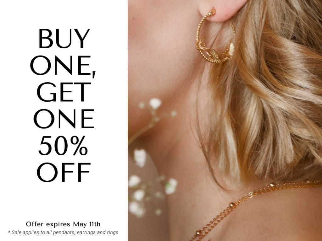
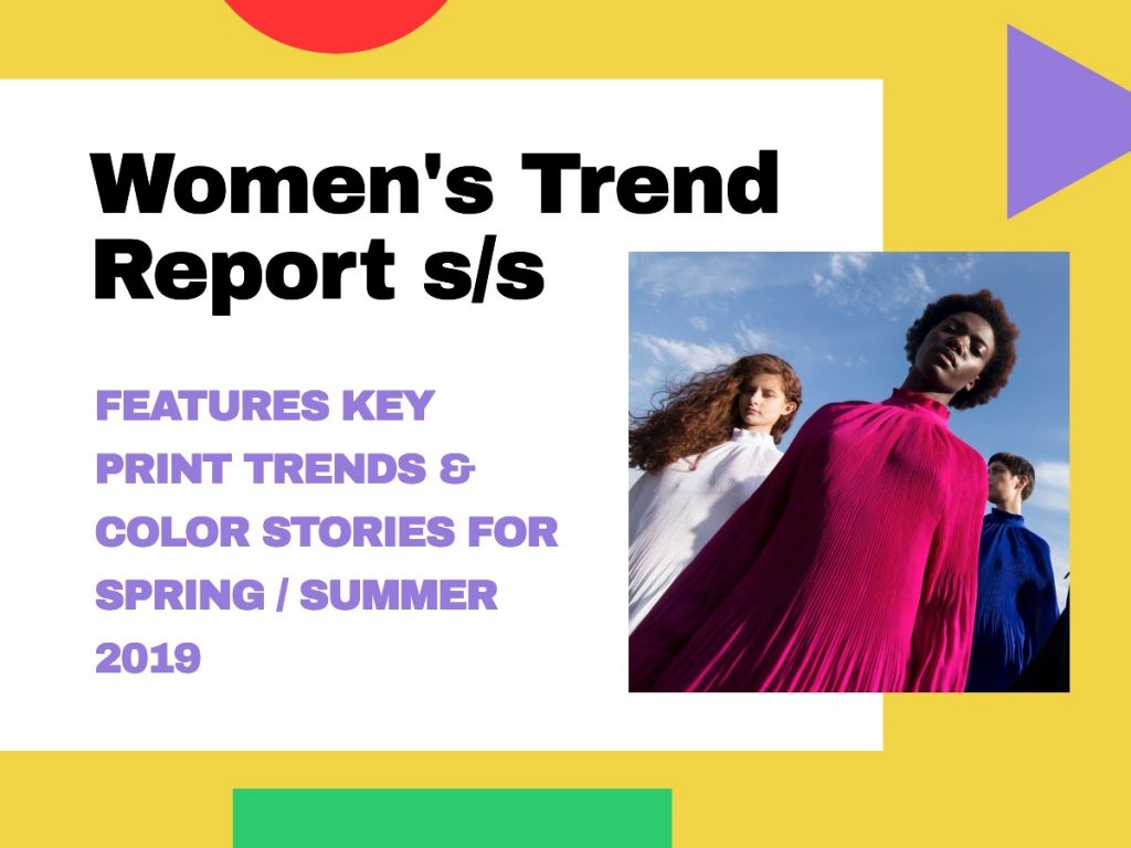
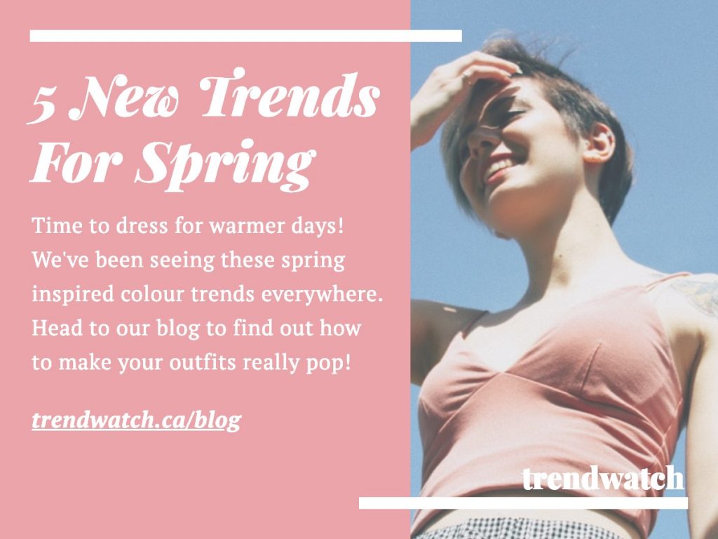
Snappa offers a number of uncommon fonts in our image builder. Take this graphic that uses the fonts Playfair Display Black (headline) and PT Serif (body text), for instance. Its pretty, stylish flair compliments the image, which clearly depicts spring fashion trends. Notice the simple, pretty colors the designer selected for the design elements, which also compliment the photo well.

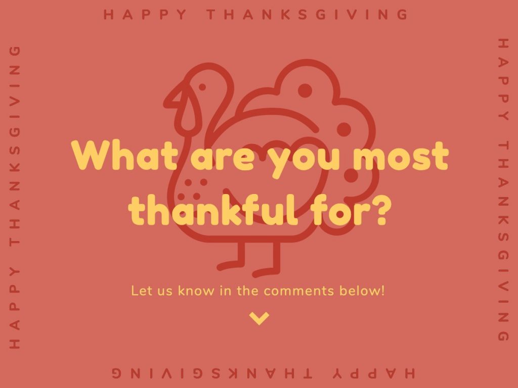
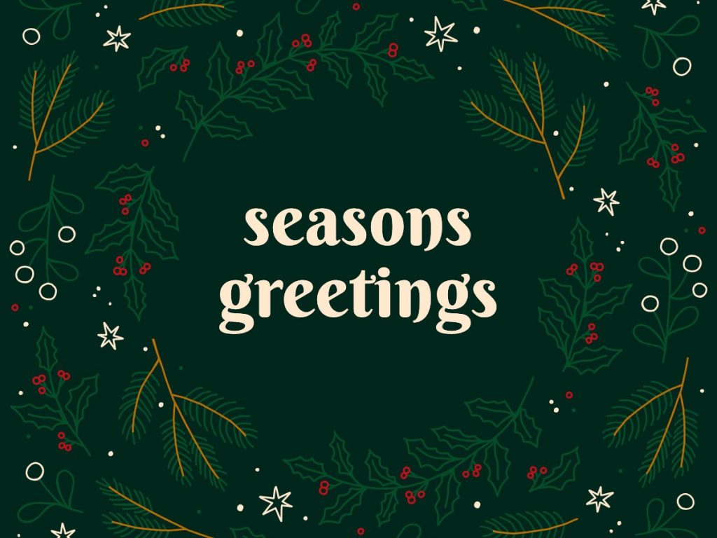
The font used in the below Seasons Greetings image, Berkshire Swash, is a bold and modern font that has all the feel of a classic serif font without actually having serifs. For a brand that wants to use a sans-serif font but would like a touch of that classic typographic style, this is a fantastic choice.

The following font that depicts the retail sale’s 70% off–Pirou–looks like a fun, stylized stencil. It’s eye-catching and simple, yet unique enough that it pops out of the graphic and catches the eye. It’s offset by Bodoni XT, a stylish serif font that pairs well with Pirou’s clean lines.
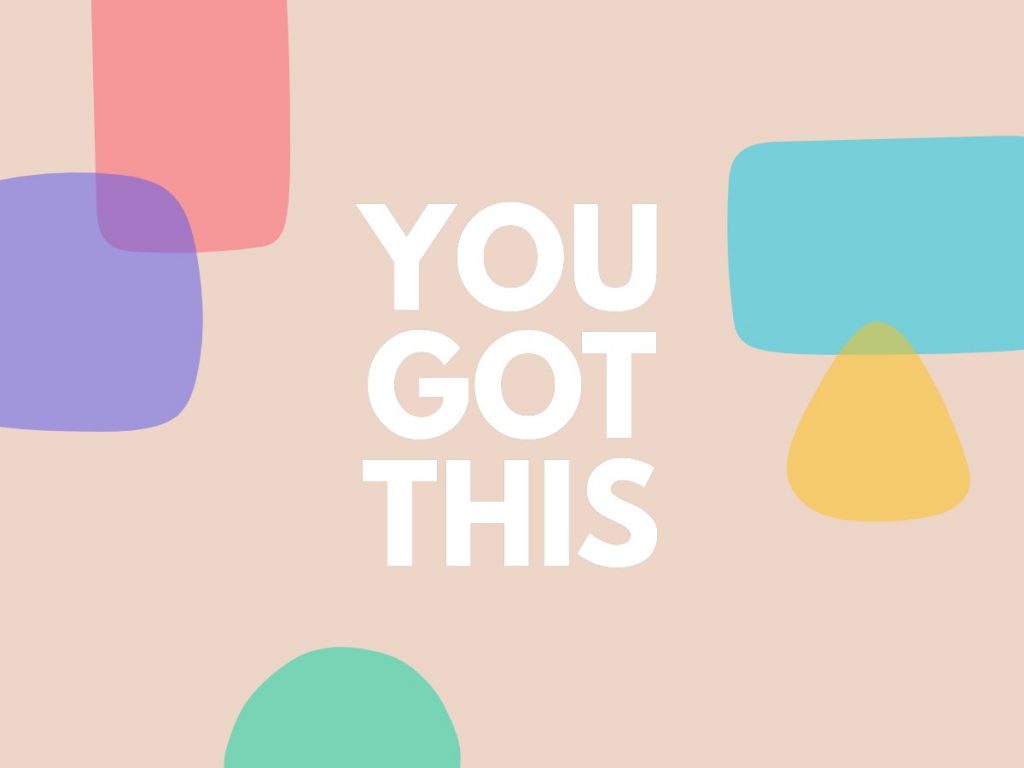
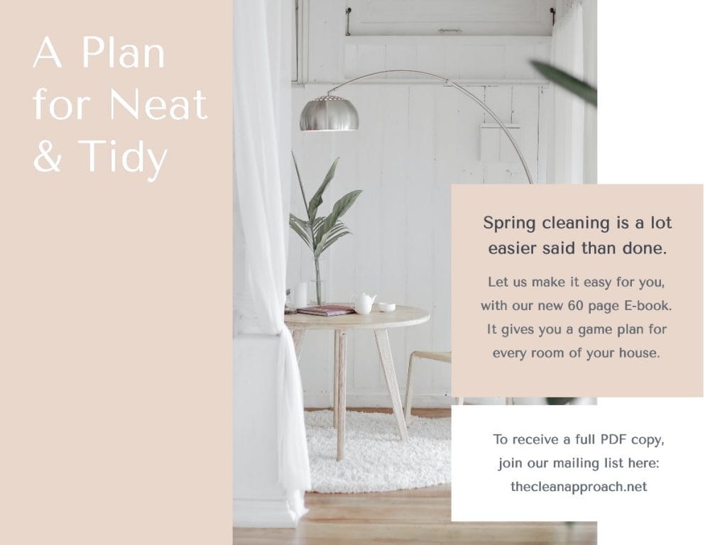
10. Minimalist Designs
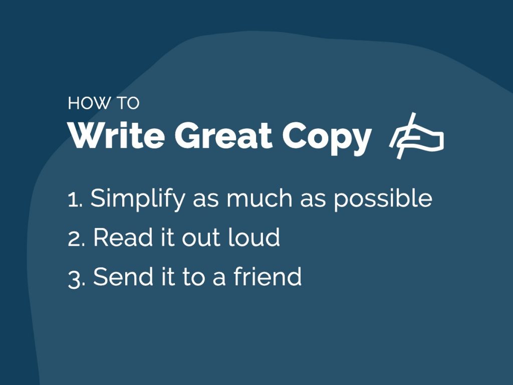
The clean, minimalist look is a modern, popular brand style. Often, we see images and graphic design pieces that are really only text on solid or minimally-designed backgrounds. Other times, we might see one image in a piece of minimalist design, but it might only appear as a small part of the graphic.
Overcrowded, overcomplicated images are not the way to go here. Instead, you want to allow for a lot of “white space” in your designs and allow the words and images to breathe.
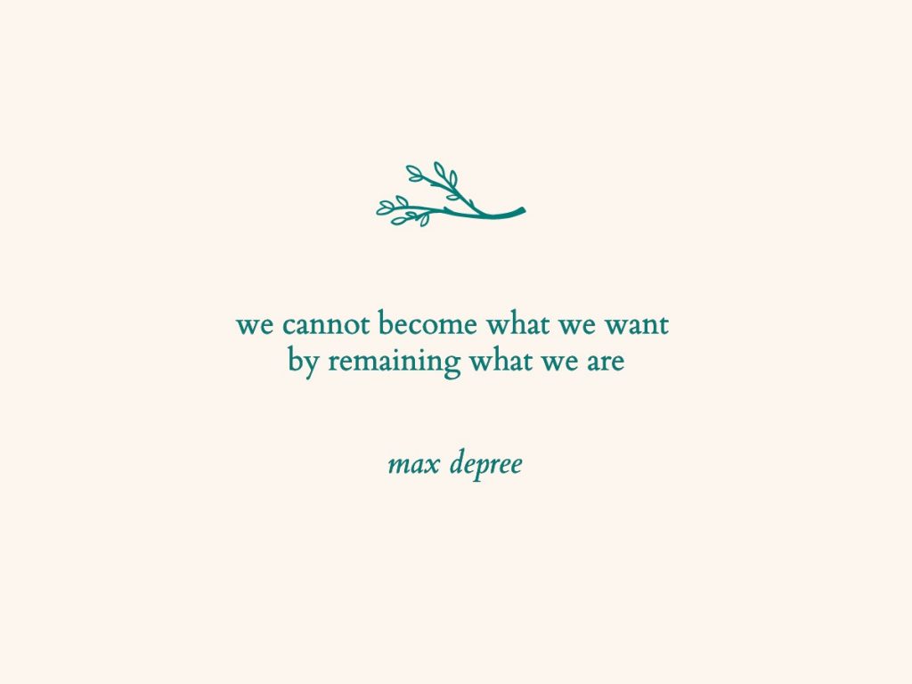
This graphic is an excellent example of minimalist design. While there’s an image included in the design–the illustration of leaves–there is plenty of room left for the illustration and the text to breathe. The design feels both classy and sleek, and its simplicity is maintained even though the illustration takes up a large amount of space in the image.

Other minimalist designs rely less on a central graphic, and more on the white space that’s left in the image. The minimalism itself is the design, and the empty space drives the design, rather than the other way around. This next example features only a small illustration in addition to the simplistic text.

11. Interesting, Quirky Illustrations
Illustrations can allow you to add your own unique style to your brand design. Using illustrations in your design–particularly on a landing page–can help you describe your process or product in a branded way.
Custom illustrations add extra pizazz to your brand and give your prospective clients an intimate look at who you are and how you stand out. Illustrations are an opportunity to depict your brand in a fresh, new way. You can use illustration to represent your brand mascots, or simply convey your brand’s values or look and feel.

Illustrated icons remain popular in designs, in addition to emojis. Emojis convey a range of emotions and can also help to inspire the emotions of your audience when they encounter your brand designs. Quirky illustrations can communicate the fun and entertainment to be had when your audience engages with your brand. Pair them with bright colors for extra pep.
12. Loud, Popping, Bright Colors
The internet is filled with endless amounts of visual content. In fact, over 1.8 billion photos are uploaded to social media a day. It isn’t easy to get your message across if your audience never gets the chance to even see it.

A recommended design trend would be to use loud and bright colors. This will help your content stand out from the meme-filled social feeds. Keep in mind, this doesn’t mean you should go out and write your text with bolded red font using an orange background. Mix colors properly so that they combine to create an eye-catching image. Using tools such as Colorhunt is perfect for choosing color combos that stand out for your visuals.
Complementary colors, such as the purple and gold used in the graphic below, are real attention grabbers, especially when they’re bright. Although muted by the purple overlay, the image in the background also contains a wide spectrum of colors that come through the purple filter to add interesting depth to the image.

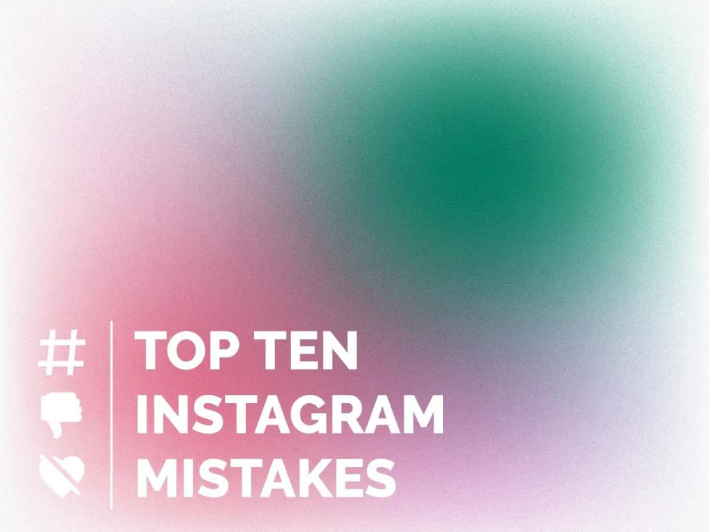
Bonus: Color transitions
We’ve seen this style emerge with the Instagram redesign and it’s quickly making its way around major brands. It is very possible for us to continue to see the use of color transitions within graphic design. Using gradients and transitional popping colors may just be the secret formula to great visuals in 2021.
The color transition below features a frosted-glass look with a range of colors that shift and blend, one into another. As a grouping, the shades of red, violet, green, and white work well to create a faded, blended color spectrum.

13. Authentic Pictures and Customized Graphics
Generic is the one thing you don’t want to be in 2021. The one size fits all approach is long gone and we’re moving into a world where companies know a baby is on the way sometimes before you do… I’m not kidding.
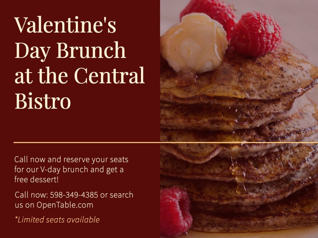

Stock photos are still very prominent. But It’s time to move away from the basic approach of just sharing a basic stock photo. If you’re going to use stock photos, incorporate the photo into a relevant text graphic. The key is to personalize the graphic as much as possible.
Given how easy it is to take professional photos, you should be using authentic pictures to showcase your content. The smartphone that you currently use can actually produce better photos than you think. In addition, user generated content is as authentic as a piece of content can get. What’s more unique and effective than having your customer document their life with your product?
As for graphics, there are plenty of ways you can create a customized piece of content without spending countless hours learning Photoshop or Adobe Illustrator. Do some research and look through the analytics to figure out the type of content your readers are interested in. Once you’ve figured that out, you can create simple graphics with online graphic design tools like Snappa (shameless plug). Whether they are quotes, statistics, industry news, you should make sure that your graphics are relevant to your brand.


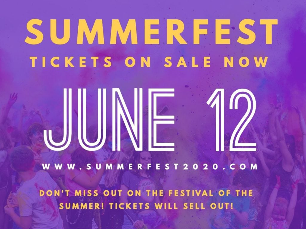
14. Unique Layouts
2021 is all about having designs that stand out and the design layout is no different. Having symmetry on your canvas has always been a standard in the trade, but companies have started to experiment away from this. Graphic designers are starting to create asymmetric designs that use neutral space in a creative way.
This asymmetrical design is an advertisement for an optical shop. In the design, the image of a happy customer is depicted in one portion. In the other portion, you’ll see the text–in this case, a clean, sans-serif typeface. The teal and white graphic design elements play well with the colors in the selected photograph.


Since symmetry has been so standard in design, it’s become generic to the eye and asymmetric designs do a great job of capturing attention because it’s so different from what we normally see. Asymmetry keeps your eyes moving along, around, and across the design, holding your attention effectively until you’ve received the information the brand intended for you to get from the image.
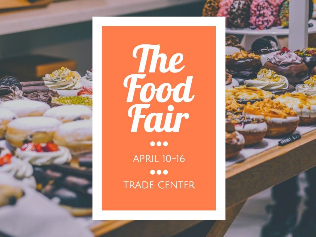
Another prominent layout design that we have seen and will continue to see in 2021 is splitting content. What this means is that a design is split into sections where information is dispersed across each section. A common split content layout is having the page as an image, while half the page is text, as in the asymmetrical design above. But another common split layout consists of text that is stored in separate elements of the graphic. Take a look at the next example for a great visual of a split layout that utilizes more than one space for text.

15. Design Elements and Overall Style
The use of patterns, lines, and circles have been prominent for a few years now and that won’t be changing anytime soon. You will continue to see patterns incorporated into designs, along with geometric shapes.
Geometric Shapes
A design element which has been around for quite sometime now and won’t phase away anytime soon. The use of shapes to create designs will continue to be a major factor in 2021. The geometric designs that will pop out the most will be ones that are combined with other popular design elements and something that is unique.

Some recent designs appear to be a throwback to the brightly colored, geometric designs of the early 1990s, so you might expect to see more of that in the near future. Think: a confetti of brightly-colored triangles and squares against boldly-colored fonts with clashing drop shadows.
Low Poly Design
A low poly design will give your piece of work a more 3D feel. Poly design has dominated the design environment over the past year and this trend does not feel like it will end anytime soon. The low poly designs are being combined with bright colors, hand drawn shapes, and duotones, to really stand out while giving a much more modern look to graphics.
Use of Typography
An element of design that has always been important to graphic design is typography. Choosing the right font, font size, font bold, and font spacing is key. In the new year, expect to see BIGGER and BOLDER fonts.
In this example, the font is absolutely the focal point of the entire piece. Its clean, boxy white letters and offset by an opaque drop shadow. The only other elements in the design are the small lightning bolt illustrations. Otherwise, the design is open and leaves plenty of room for the font to shout.
I keep talking and emphasizing the importance of having your designs stand out in 2021 and unfortunately it applies here as well. Keep the font style simple and readable, but make sure it’s big enough for the reader to wonder whether or not you’re screaming at them.
Other Emerging Design Elements
Cropped Elements – A minimalist approach where texts are cropped so that parts of the letters are missing, but the text can still be read.
Semi-flat design – Soft shadow on flat design which makes it look like the design is floating.
3D design and fonts – Three-dimensional designs rendered by professional digital illustrators that are both colorful and lively.
16. Moving Visuals
When we talk about moving visuals, we’re getting into a more advanced side of graphic and web design. Although these may not apply to you, I wanted to outline some of the trends that are taking place in this technical and cool part of design. In addition to animated GIFs, cinemagraphs, and animated illustrations, videos continue to be an important part of digital design.
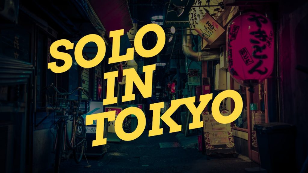
You can rely on a bold font against a muted background to draw viewers in for a click, too, as in the thumbnail example below.
Finally, when appropriate, don’t hesitate to incorporate elements of nature into your designs, too. They work in video thumbnails, just as they work in other forms of digital media.
When you create videos for social media platforms such as YouTube, you’ll need thumbnail images to display in the intro and outro of your video. These thumbnails give viewers an idea of what they’re going to be watching before they click on a video. You can incorporate any of the graphic elements discussed in this article to make truly eye-catching video thumbnails.
Here’s a great example of a thumbnail that uses eye-popping color, fun design elements, and beautiful photography, and a simple font to convey its message.

You can rely on a bold font against a muted background to draw viewers in for a click, too, as in the thumbnail example below.

Finally, when appropriate, don’t hesitate to incorporate elements of nature into your designs, too. They work in video thumbnails, just as they work in other forms of digital media.

Final Thoughts
Graphic design is not an easy task and if you haven’t designed before, it won’t be easy for you to incorporate all of the elements mentioned above.
Start with the basics and begin to implement authentic visuals first, if you haven’t already done so. From there you can begin to experiment with shapes, font combinations, and combining the elements we mentioned above into a single graphic. Remember because I may not have mentioned this before but, make your visuals STAND OUT!
There’s no single graphic design trend that will solve your issues. The best way to achieve a graphic design that works is by testing and by using a variety of different design elements and graphic design trends together. Be different in your designs, but do so with the design trend fundamentals in mind.
Do you have any other graphic design trends that you think will be prominent in 2021? Leave a comment down below and let me know!